
do it for her…
Do what? uwu
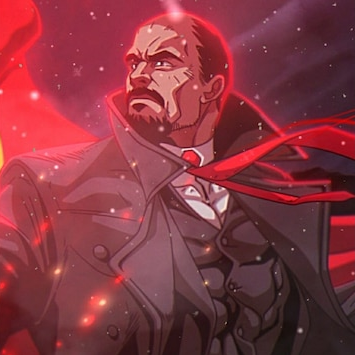
Impressive. Did you make this yourself? What software did you use? GIMP?
I like the placement of the panels and the colour palette. The fuschia of the chain is slightly different but it’s balanced because the tie in bottom right and the central character’s eye bridge between that fuschia and the neon pink in the background panels.
Have you tried ‘muting’ the middle two bright panels slightly? This would make the central figure stand out a little more. But this might alter the aesthetic quite a bit, depending on where your icons are.
The angles make it look like the character is in motion. You could align the front-left chain, the central character, the bottom-right tie, and the top-right indigo chain. This might make the image seem less busy, less energetic. Tbh, though, I like the energy of it, so I wouldn’t try to straighten everything up, as this might make the offset background panels appear wonky. As it is, they have a sense of chronology.
I didn’t make it but thanks for the advice!
Haha, in that case, I can still commend you on your taste.
6/10
