Figuring out what size works best for the tileset I have made this far. I am glad that I found some time between commissioned work to get around this jam, it has been a nice change of pace to from ortho to iso. It has also been a challenge, mad respect for FFT pixel artists.
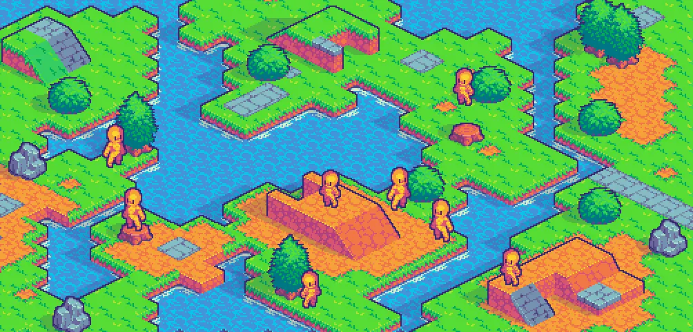
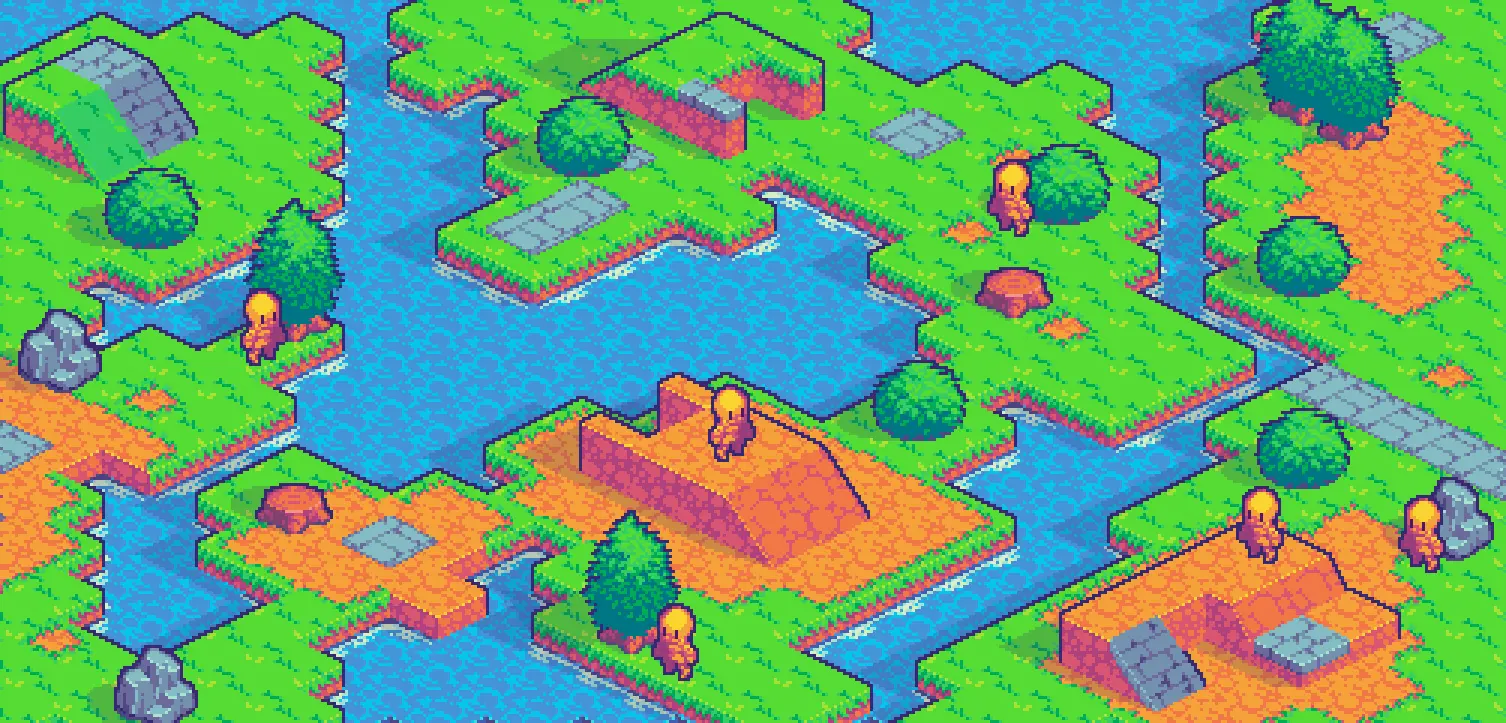
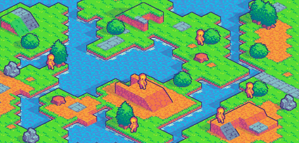
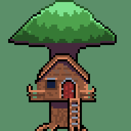
First I made an educated guess based on the tree size, which is roughly one and a half block. So I went for like, one and a quarter, this way the character wouldn’t look huge while compared to a tree.
It looked decent enough, but felt that the overall vibe of the tileset asked for something a bit more cartoonish/SD, so went down 1/4 of a block. That version looked great already, matching the vibe, but I felt like trying at least one size down.
So I went down roughly 2px on each direction. It gave me a much simpler character that looked adorable and matched it nicely.
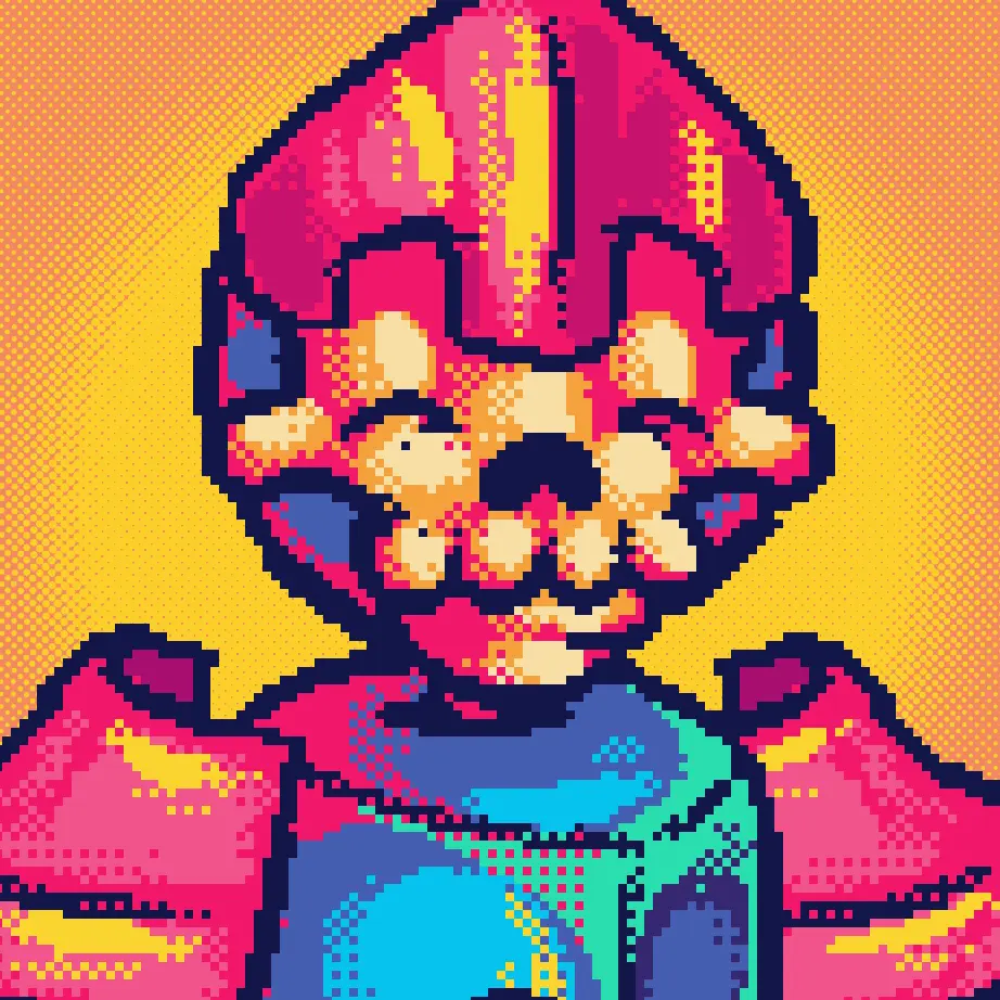
Speaking of which:
It does look incredible!
Thank you! Now I am in the process of turning that basic character into an actual character. Lets see how many I can flash out before the jam is done!